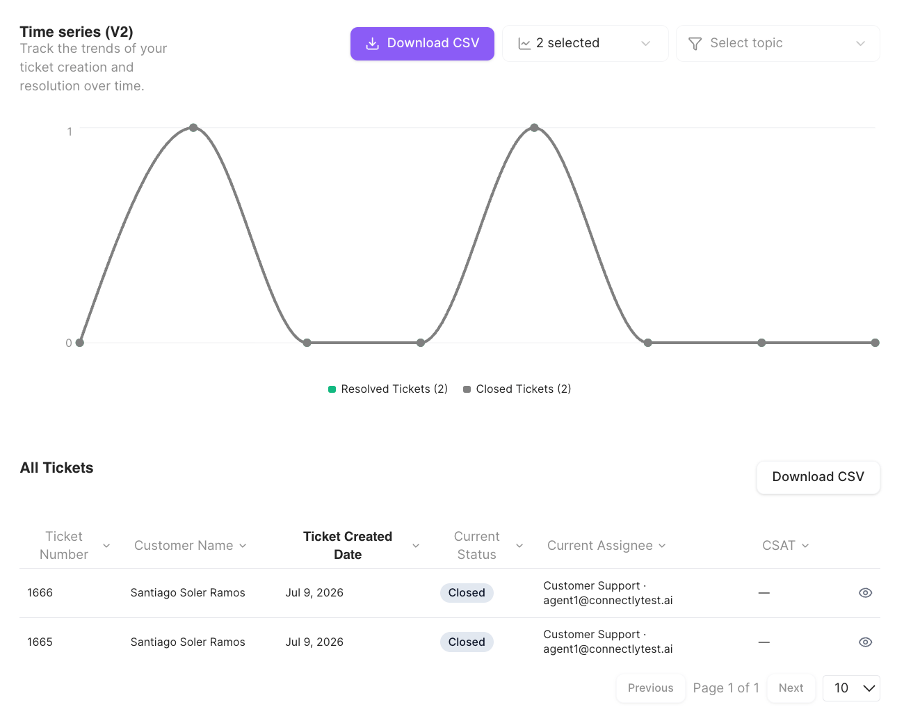
Tickets, teams & agents
Per-ticket data plus team and agent performance tables.
Live monitoring & auto-assignment
Real-time open tickets, queued rooms, and auto-assignment performance.
How to read the dashboard
- Date range — pick Last 7 days, Last 1 month, Last 3 months, or a custom range. Every metric compares the selected period against the previous equivalent period, so each card shows a change (up/down) versus before.
- Store — if your business has store locations, filter the dashboard to a specific store (or All Stores).
- Download CSV — most cards have their own Download CSV button, and the export usually contains more columns than what’s shown on screen.
- Drill down — where you see an eye icon, click it to open that conversation in the Inbox.
What you see depends on your role. Agents see only their own Agent Performance card (covered in Tickets, teams & agents). Owners and analytics roles see the full dashboard. Some cards depend on your plan and configuration and may not appear.
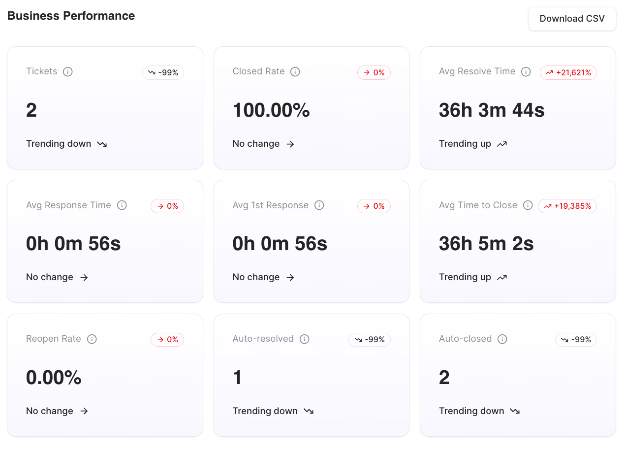
Business Performance
The top card is a grid of business-wide KPIs. Each shows its current value and the change versus the previous period.The Avg CSAT Score and CSAT Response Rate cards appear when the Customer Satisfaction Survey is enabled and survey data exists.
Timegraph
The Timegraph plots ticket activity over the selected date range so you can spot trends. It charts four series:- Created Tickets
- Resolved Tickets
- Closed Tickets
- Reopened Tickets