> ## Documentation Index
> Fetch the complete documentation index at: https://docs.connectly.ai/llms.txt
> Use this file to discover all available pages before exploring further.
# Inbox analytics
> Measure your team's support performance — ticket volume, response and resolution times, CSAT, and trends over time 📊
Inbox analytics shows how your support operation is performing — how many tickets you
handle, how fast you respond and resolve, and how those numbers trend over time. Find
it under **Analytics → Inbox**.
The Inbox tab is a single page made of stacked cards. This overview covers how to read
the dashboard and its headline metrics; the tables and live views have their own
articles:
Per-ticket data plus team and agent performance tables.
Real-time open tickets, queued rooms, and auto-assignment performance.
## How to read the dashboard
* **Date range** — pick **Last 7 days**, **Last 1 month**, **Last 3 months**, or a
custom range. Every metric compares the selected period against the previous
equivalent period, so each card shows a change (up/down) versus before.
* **Store** — if your business has store locations, filter the dashboard to a specific
store (or **All Stores**).
* **Download CSV** — most cards have their own **Download CSV** button, and the export
usually contains more columns than what's shown on screen.
* **Drill down** — where you see an eye icon, click it to open that conversation in the
Inbox.
What you see depends on your role. **Agents** see only their own **Agent Performance**
card (covered in [Tickets, teams & agents](/inbox/analytics-performance)).
**Owners** and analytics roles see the full dashboard. Some cards depend on your plan
and configuration and may not appear.
## Business Performance
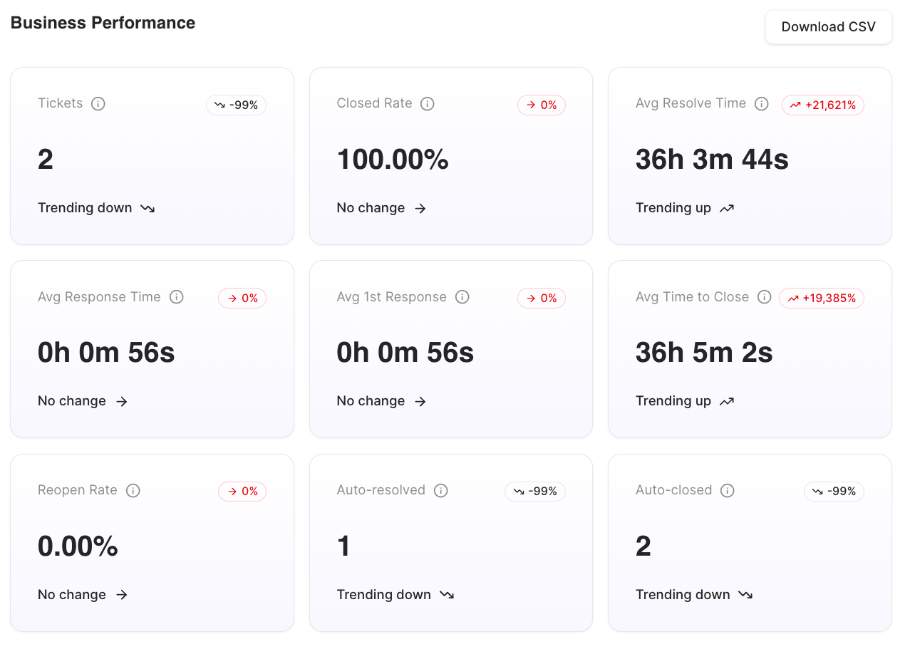
The top card is a grid of business-wide KPIs. Each shows its current value and the
change versus the previous period.
| Metric | What it measures |
| ---------------------- | ---------------------------------------------------------------------------------- |
| **Tickets** | Total number of tickets created in the period. |
| **Closed Rate** | Share of tickets resolved and closed in the period (Closed ÷ Total). |
| **Avg Resolve Time** | Average time to resolve a ticket, from creation. |
| **Avg Response Time** | Average time to respond to follow-up messages across tickets. |
| **Avg 1st Response** | Average time to the first response on a ticket. |
| **Avg Time to Close** | Average time to fully close a ticket, from creation. |
| **Reopen Rate** | Share of tickets the customer messaged again after "resolved" but before "closed". |
| **Auto-resolved** | Number of tickets auto-resolved (by inactivity) rather than by an agent. |
| **Auto-closed** | Number of tickets auto-closed rather than by an agent. |
| **Avg CSAT Score** | Average post-ticket satisfaction score. |
| **CSAT Response Rate** | Share of tickets where the customer answered the CSAT survey. |
The **Avg CSAT Score** and **CSAT Response Rate** cards appear when the
[Customer Satisfaction Survey](/inbox/customer-satisfaction-survey) is enabled and
survey data exists.
 ## Timegraph
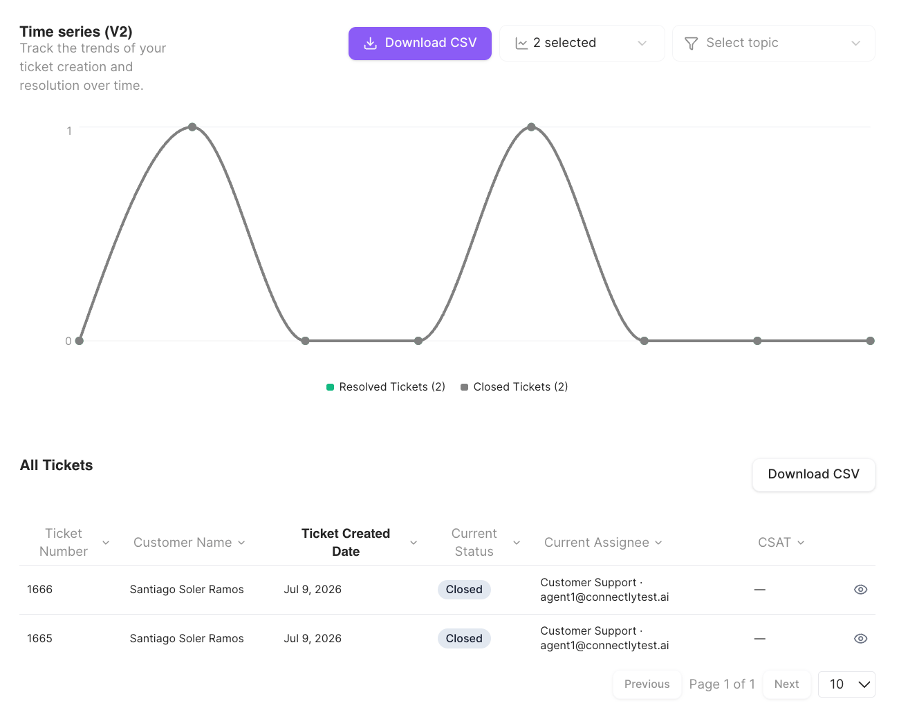
The **Timegraph** plots ticket activity over the selected date range so you can spot
trends. It charts four series:
* **Created Tickets**
* **Resolved Tickets**
* **Closed Tickets**
* **Reopened Tickets**
You can narrow the chart by **topic** — selecting one adds a line for closed tickets of
that topic. The chart also has its own **Download CSV**.
## Timegraph
The **Timegraph** plots ticket activity over the selected date range so you can spot
trends. It charts four series:
* **Created Tickets**
* **Resolved Tickets**
* **Closed Tickets**
* **Reopened Tickets**
You can narrow the chart by **topic** — selecting one adds a line for closed tickets of
that topic. The chart also has its own **Download CSV**.